September 2024
Your Color Palette
A Bright Spin on Retro Hues
Retro-ish
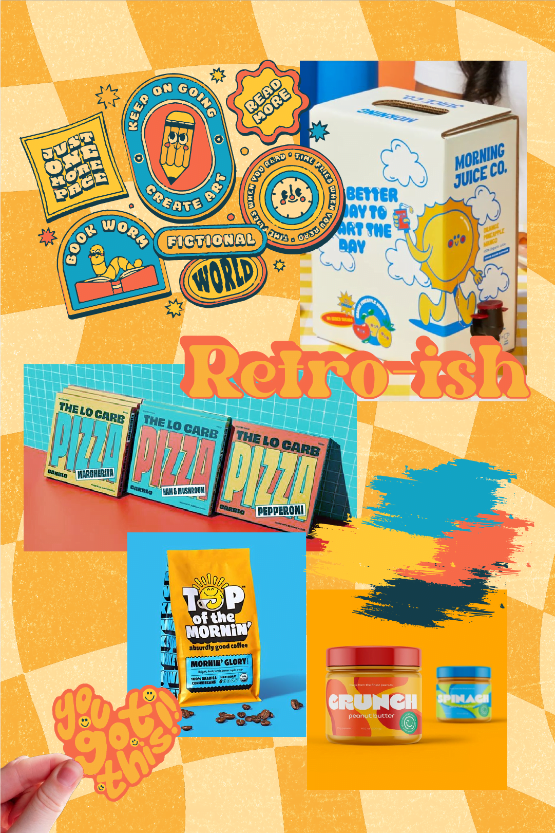
This September, we’re reviving the nostalgic allure of retro design with our Retro-ish color palette. This collection reimagines classic retro tones through a vibrant, contemporary lens, infusing bright, modern energy into traditional hues. The result is a striking blend that brings a fresh, dynamic twist to retro aesthetics.
The Colors & Their Psychology
Each color in this palette has been carefully selected not just for its visual appeal but for the emotions and responses it evokes:
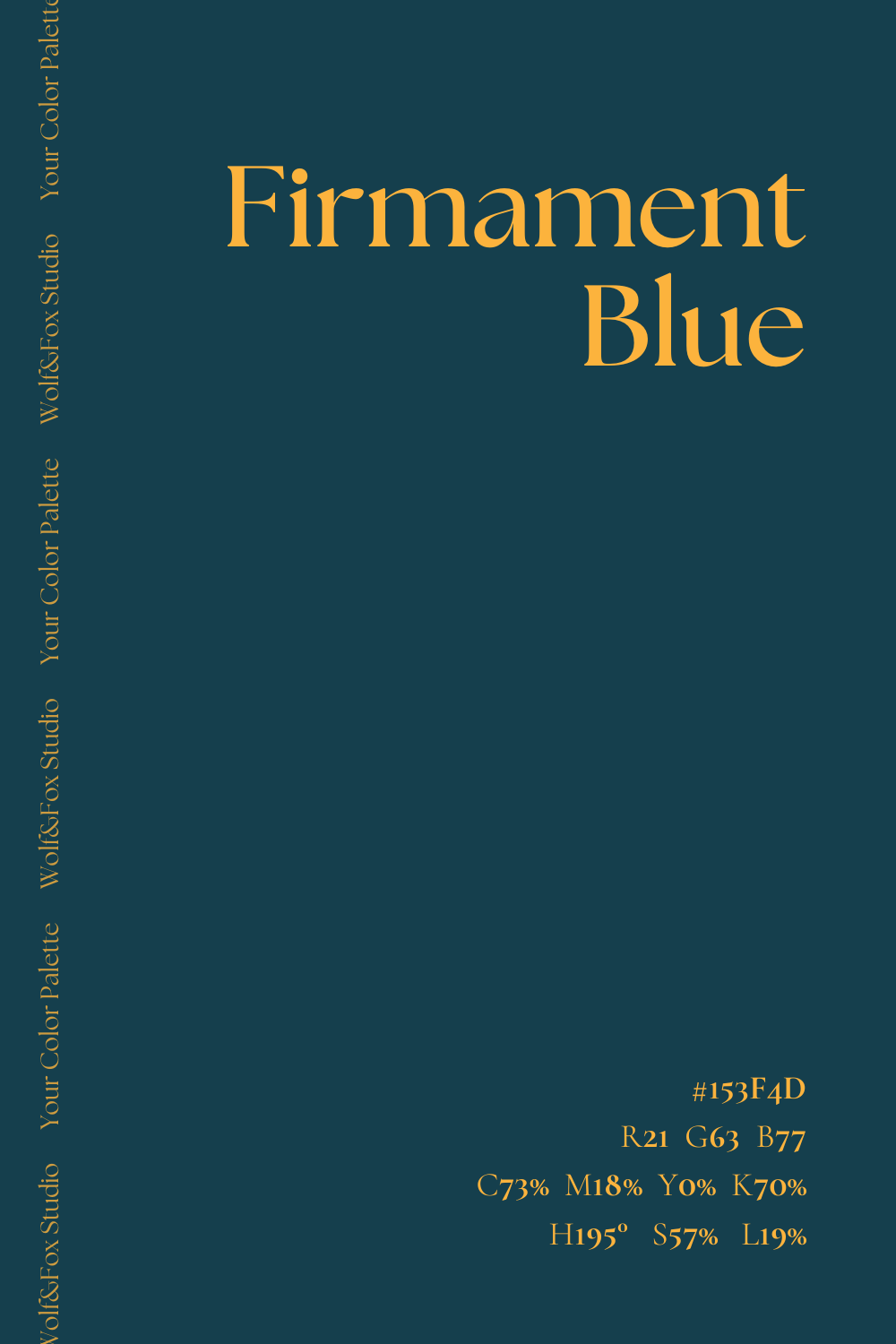
#153F4D
Firmament Blue
This deep, grounding blue provides a sense of stability and trust. It’s a color that speaks of reliability, making it ideal for brands looking to convey a sense of dependability.
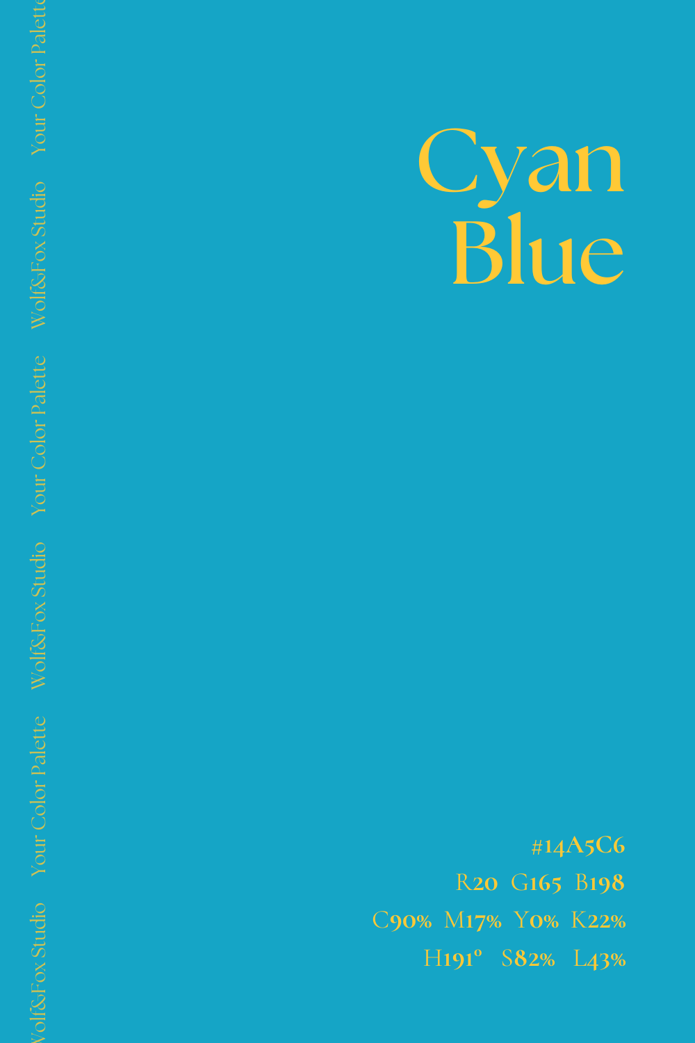
#14A5C6
Cyan Blue
Energetic and refreshing, this bright blue brings a sense of clarity and openness. It’s perfect for capturing attention and conveying a message of innovation and progress.
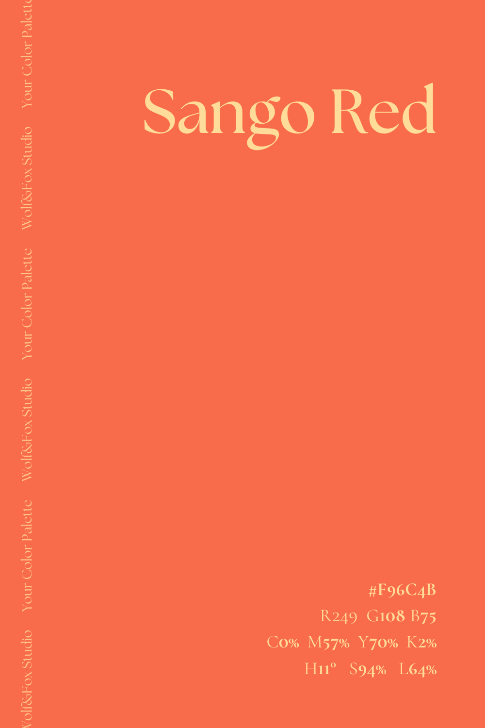
#F96C4B
Sango Red
This striking orange-red is lively and dynamic, evoking excitement and enthusiasm. It’s a color that demands attention and injects a sense of fun and energy into a design.
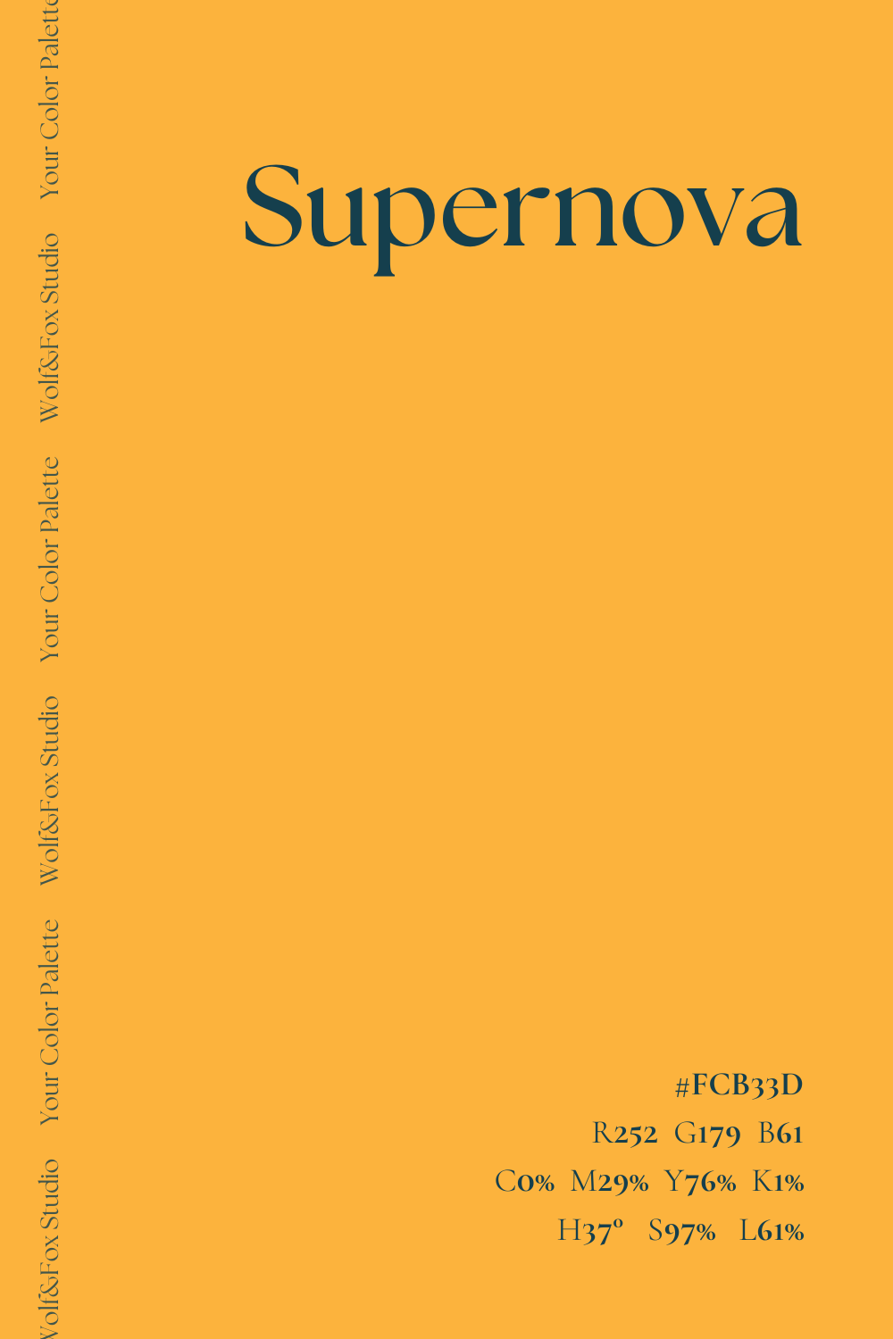
#FCB33D
Supernova
A bright, warm golden yellow that radiates positivity and optimism. This color can add a touch of warmth and friendliness to a brand, making it feel approachable and welcoming.
#FFC936
Sunglow
Slightly softer than Supernova, Sunglow adds a cheerful, inviting glow. It’s a color that feels uplifting, perfect for brands that want to inspire happiness.
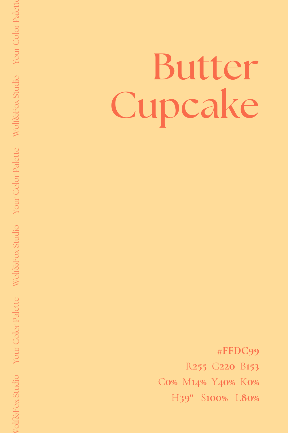
#FFDC992
Butter Cupcake
This soft, creamy yellow brings a sense of comfort and ease. It’s a subtle color that can be used to create a calm, nurturing environment.
Mixing & Matching
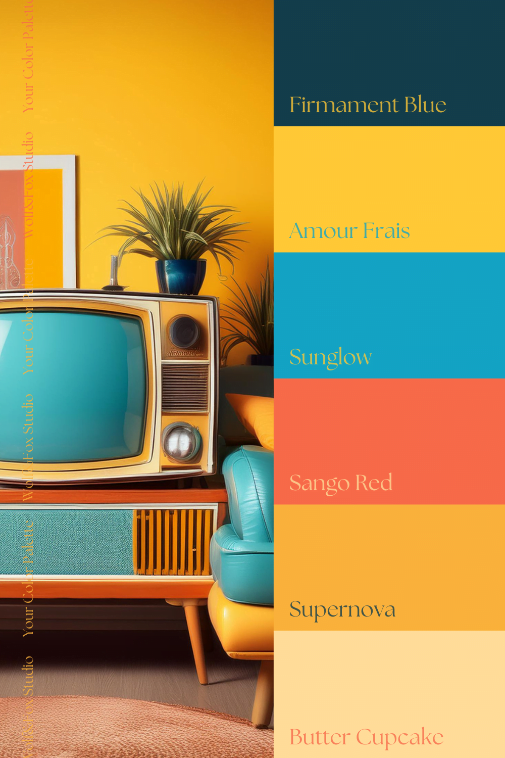
The Retro-ish palette offers versatile combinations, allowing for a wide range of visual effects
Playful and Vibrant Look
Combining Sango Red and Supernova results in a lively and energetic feel. This pairing exudes creativity and excitement, ideal for brands looking to showcase a fun, dynamic image.
Bright and Optimistic Look
Pair Cyan Blue with Sunglow to create a fresh, uplifting vibe. This combination works well for brands aiming to project innovation and positivity, perfect for technology or wellness sectors.
Bold and Grounded Look
Using Firmament Blue with Butter Cupcake offers a stable yet approachable aesthetic. This combination suggests reliability with a touch of warmth, suitable for brands in finance or education.
Industry Applications
This palette is suited for brands across various industries that embrace creativity, innovation, and a hint of nostalgia:
Event Planning
The Retro-ish palette’s vibrant energy can elevate event promotions, infusing them with joy and excitement. Perfect for events designed to captivate and engage.
Education
The cheerful hues make educational materials more engaging and approachable. This palette helps transform learning environments, enhancing student interest and involvement.
Media & Entertainment
The bold tones are ideal for creating striking visuals that capture attention and convey a message of creativity. Suitable for film, music, or digital media projects.
Real-World Applications
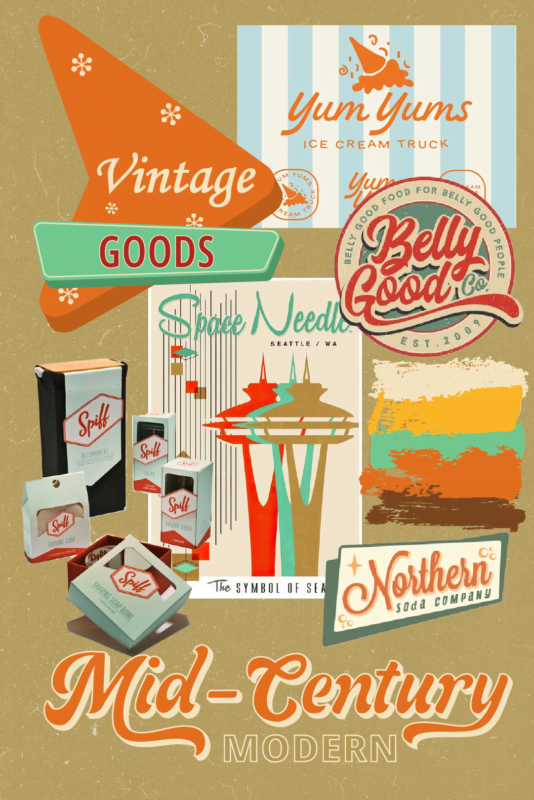
The Retro-ish palette isn’t just a collection of vibrant colors – it’s a key component of a creative visual identity project! This palette shows off how these bright retro hues can be blended to form a cohesive and captivating brand story.
Want to see how these colors play together in action? Check out our visual identity project to discover how the Retro-ish palette transforms into a dynamic and engaging brand identity. It’s a perfect example of how retro charm meets modern vibrancy in a real-world application!
Want to Bring This Palette to Life?
If you’re interested in incorporating the colors of September’s “Your Color Palette” into your brand identity, Wolf&Fox Studio is here to help. We offer a variety of branding services, including logo design, brand strategy, and web design. Contact us today to discuss how we can help you create a brand that is both stylish and effective.

