November 2024
Your Color Palette
Designing a world of ageless sophistication.
Velvet Reverie
Step into a world where luxury and premium appeal meet subtle sophistication. The curated color palette of deep, rich tones exudes timeless elegance, ideal for brands aiming to position themselves as high-end and refined. Each hue is carefully selected to convey a sense of exclusivity, stability, and aspiration. Whether creating a sense of trust, evoking warmth, or suggesting opulence, this palette resonates deeply with consumers on a psychological level, ensuring your brand leaves an unforgettable impression.
The Colors & Their Psychology
Each color in this palette holds a distinct psychological significance, contributing to the overall message of sophistication and elegance. Let’s explore the essence of these hues:
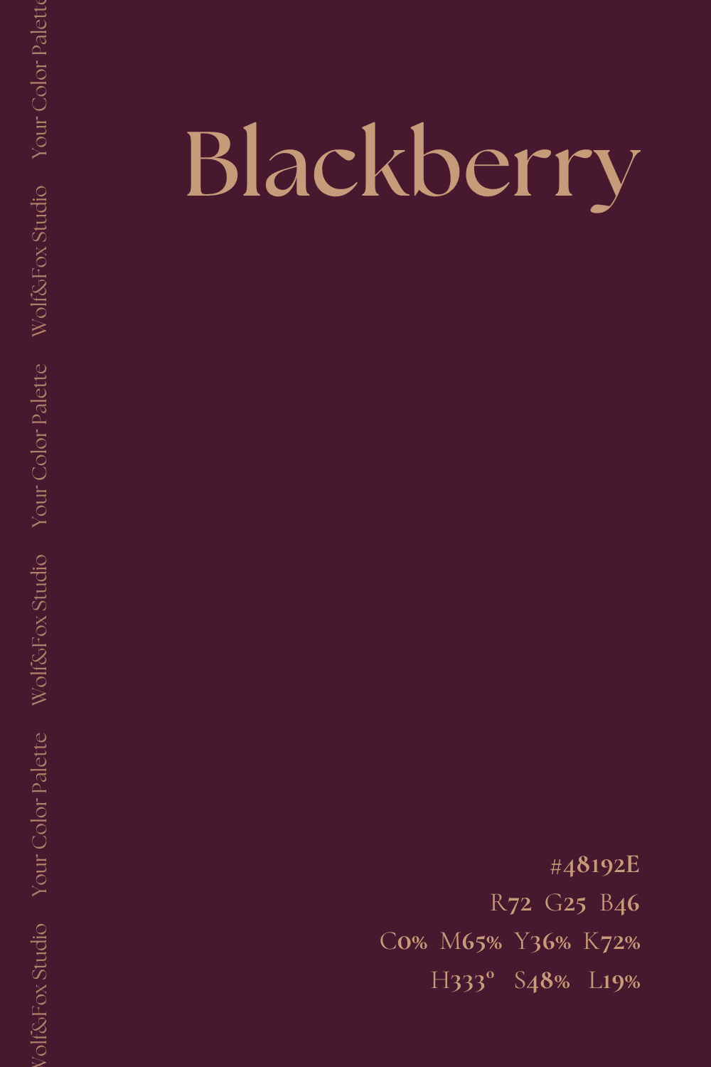
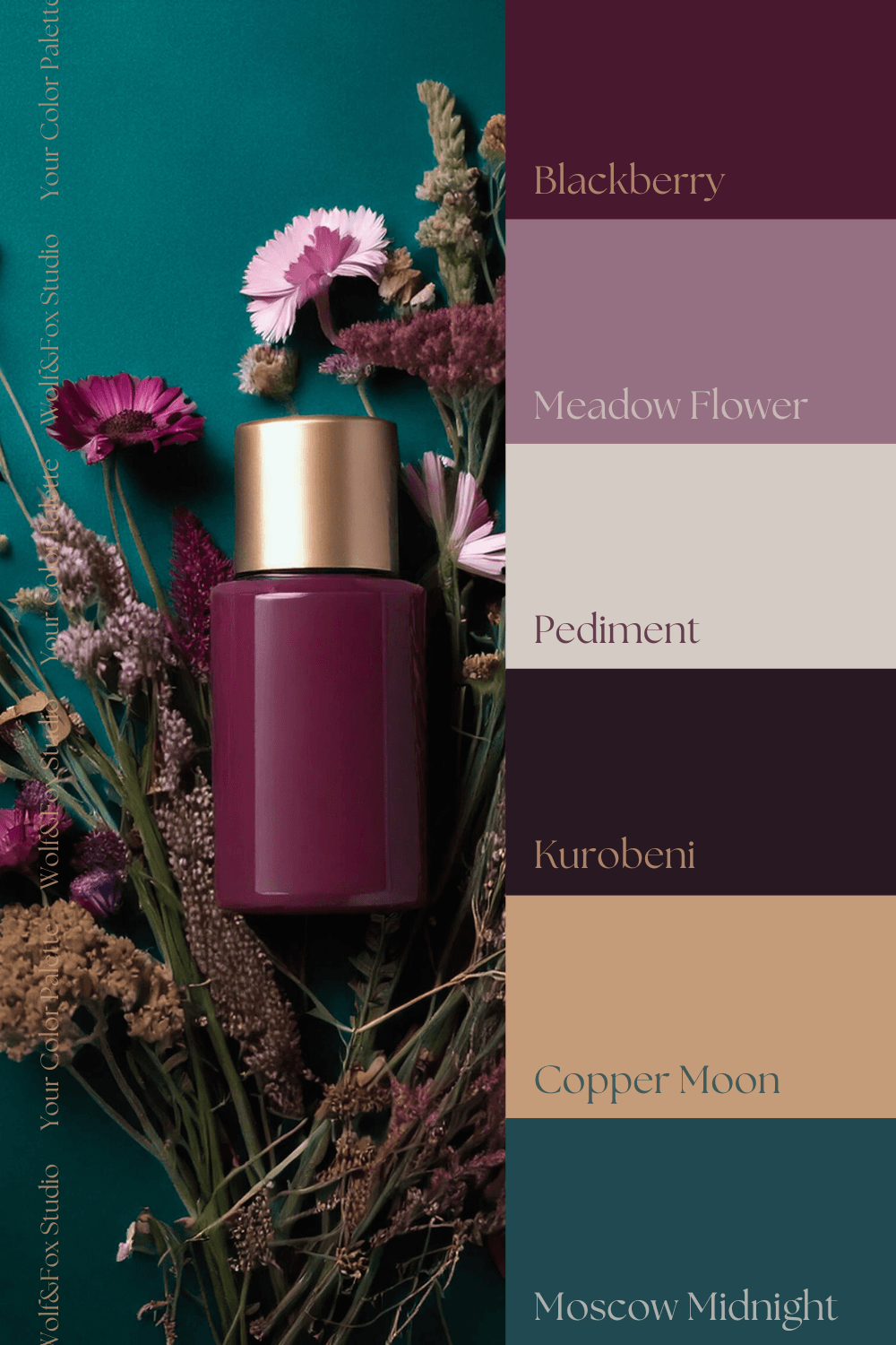
#48192E
Blackberry
A deep, regal purple that symbolizes power and luxury. Historically associated with royalty, this shade conveys ambition and prestige, making it perfect for brands seeking to project authority and exclusivity.
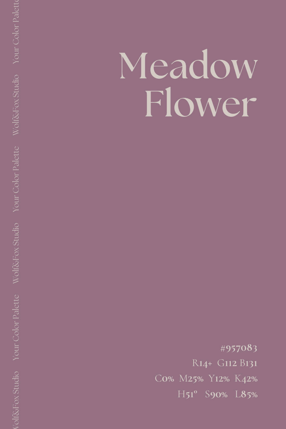
#957083
Meadow Flower
A gentle, muted purple offering a softer take on sophistication. This tone evokes calmness and creativity, providing balance to bolder hues in the palette while still maintaining an air of elegance.
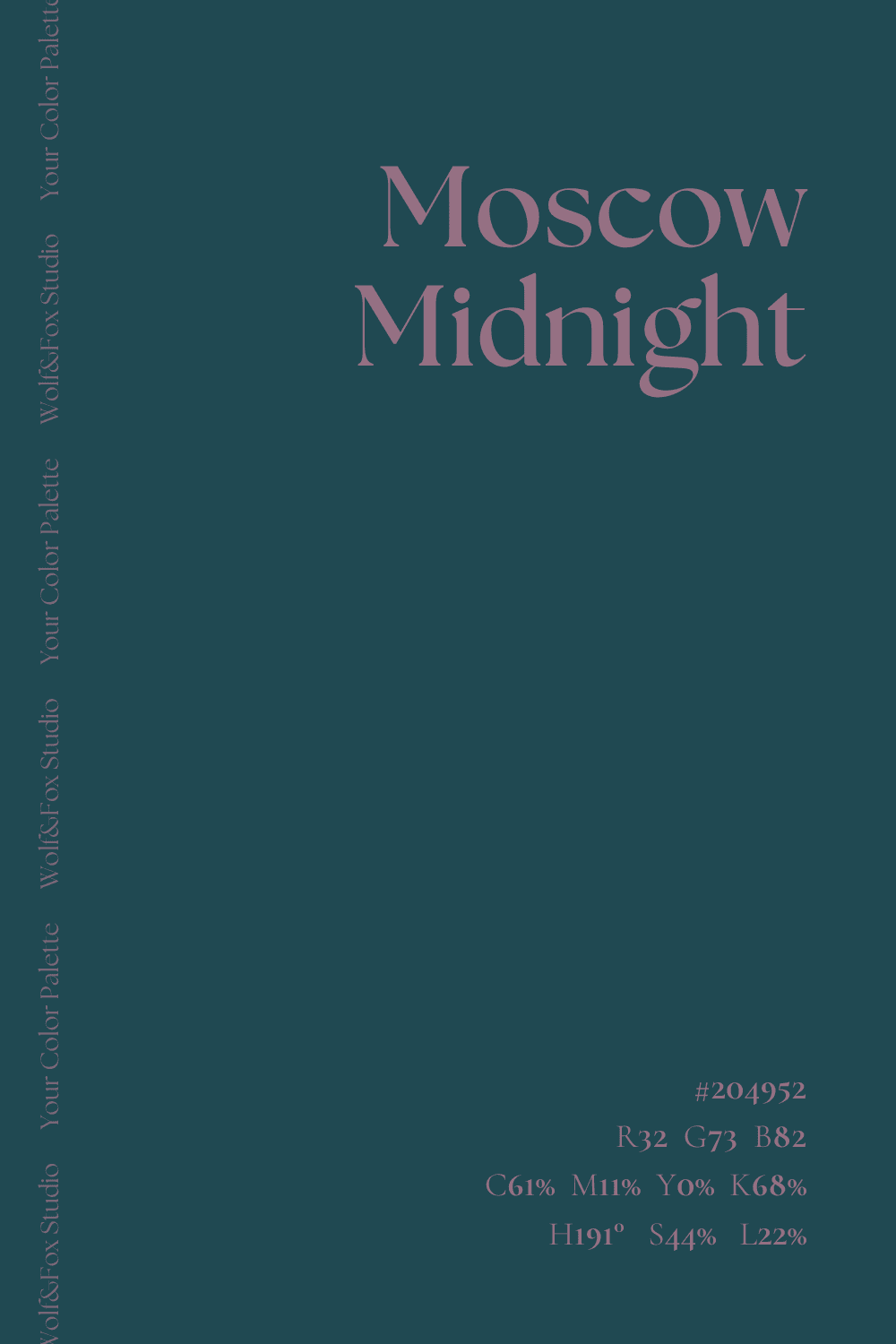
#204952
Moscow Midnight
A dark-toned blue exuding trust and reliability. This color is commonly associated with depth and intelligence, grounding the palette and adding a mysterious, dependable undertone.
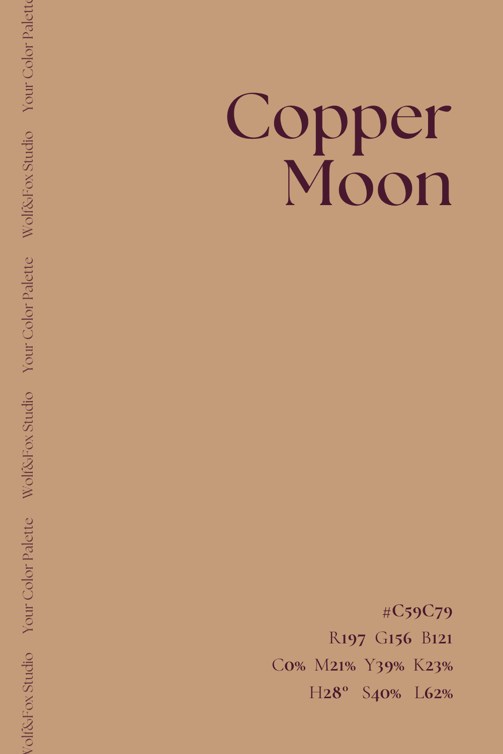
#C59C79
Copper Moon
A refined light brown with golden undertones that symbolizes wealth and achievement. This color’s warmth creates a sense of comfort and affluence, adding a luminous contrast to the darker hues.
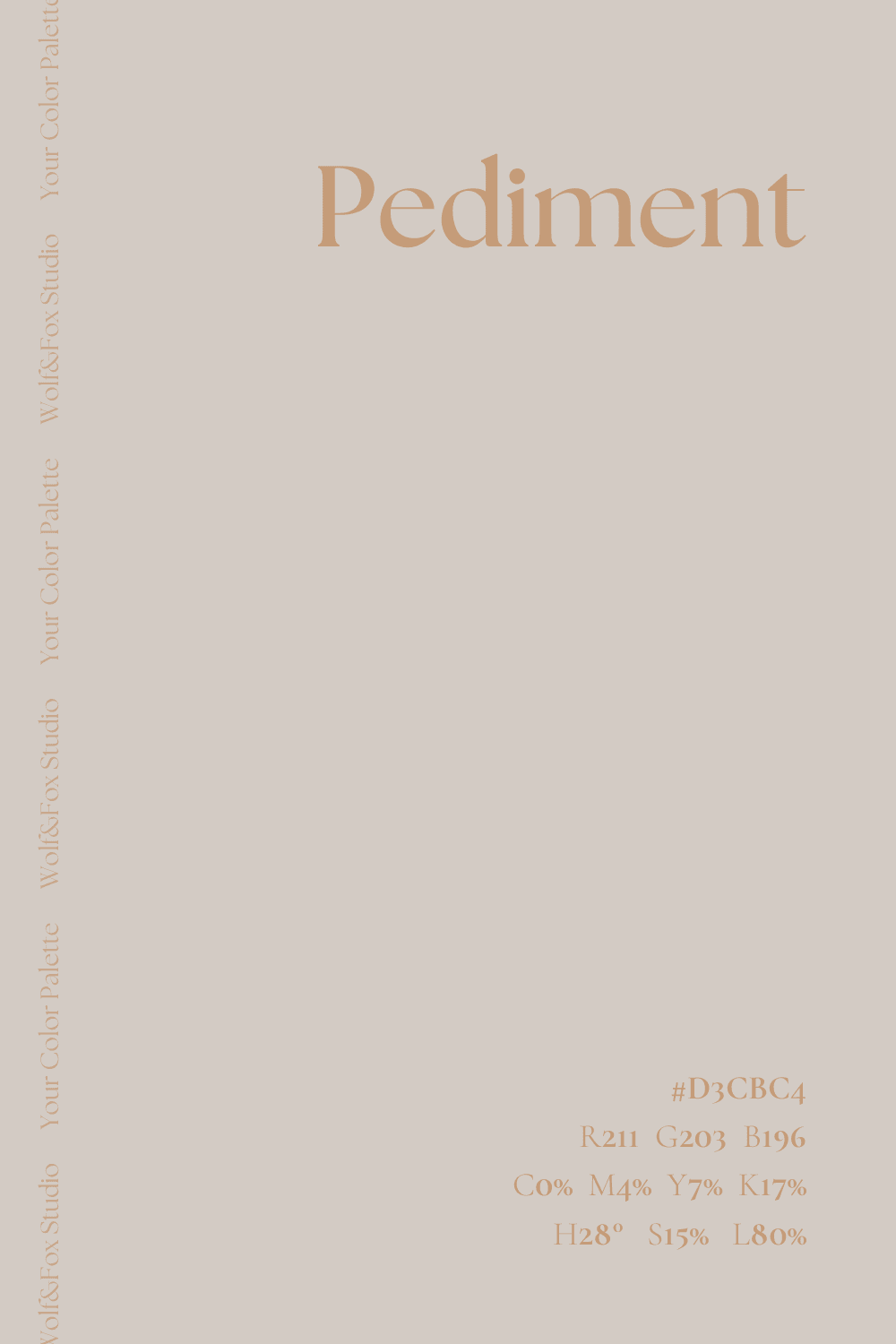
#D3CBC4
Pediment
A light, neutral beige that brings softness and subtlety. Its understated elegance ties the palette together, ensuring harmony and approachability across applications.
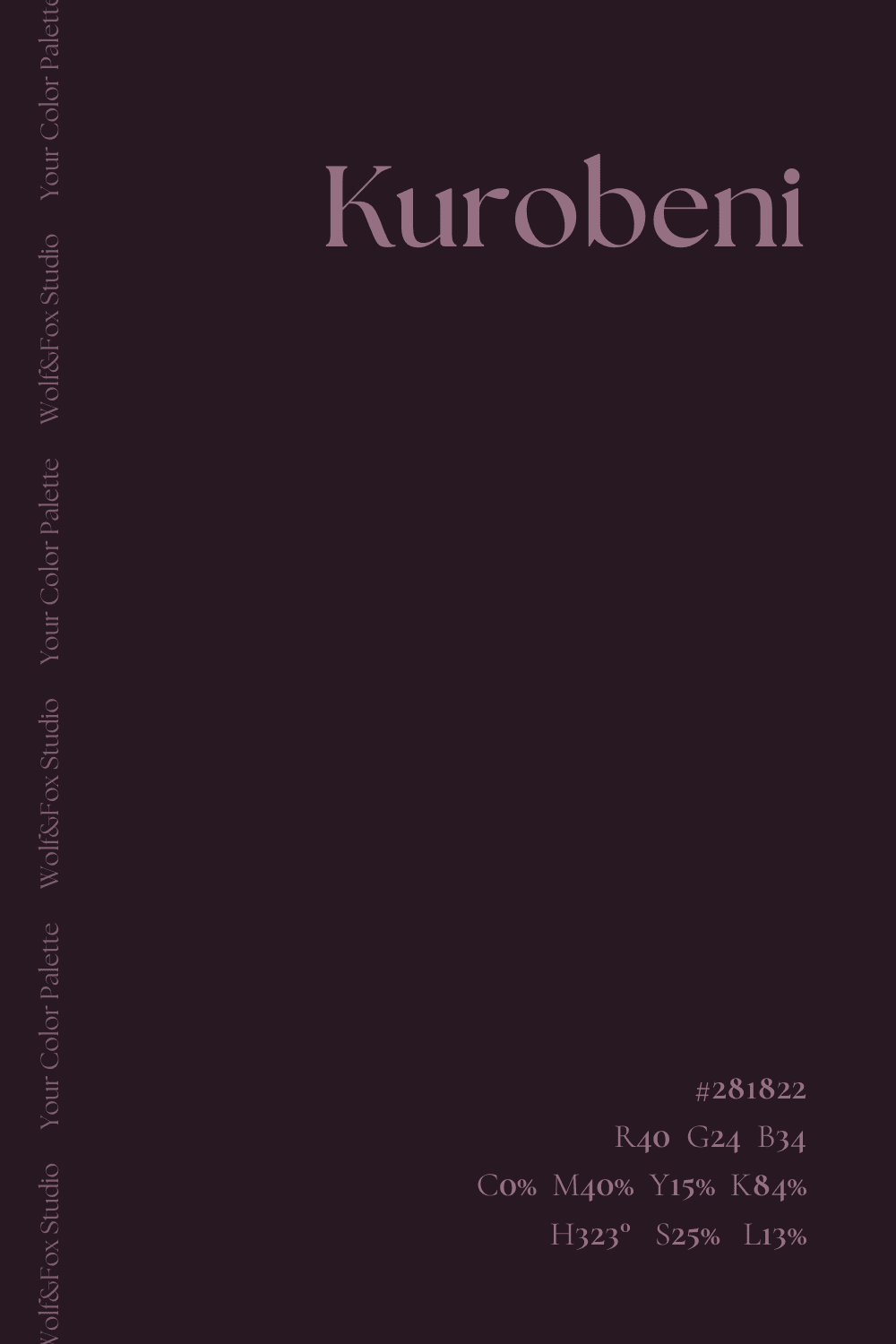
#281822
Kurobeni
A nearly black purple that deepens the palette’s mystique. It adds dramatic intensity, making it ideal for bold accents or emphasizing luxury in branding.
Mixing & Matching
Whether contrasting or harmonizing, these colors collectively communicate an overarching sense of elegance, trust, and premium quality. By strategically leveraging these hues, brands can appeal to emotions and values that resonate deeply with their target audience.
Mystic Depth Blackberry and Moscow Midnight
Blackberry and Moscow Midnight
This pairing balances the richness of Blackberry’s regal purple, symbolizing luxury, creativity, and ambition, with Moscow Midnight’s dark blue, evoking trust and stability. Together, these colors create a sophisticated yet mysterious vibe, ideal for brands seeking to project prestige with a grounded edge. This combination works well in industries like luxury tech or exclusive financial services, where authority and reliability are key.
Soft Grandeur
Meadow Flower and Copper Moon
Meadow Flower’s muted purple adds a touch of serenity and creativity, while Copper Moon’s golden-brown tones bring warmth, wealth, and elegance. The blend creates an inviting yet refined aesthetic, perfect for boutique hospitality or artisanal brands. It communicates comfort, inspiration, and affluence, striking a balance between approachability and sophistication.
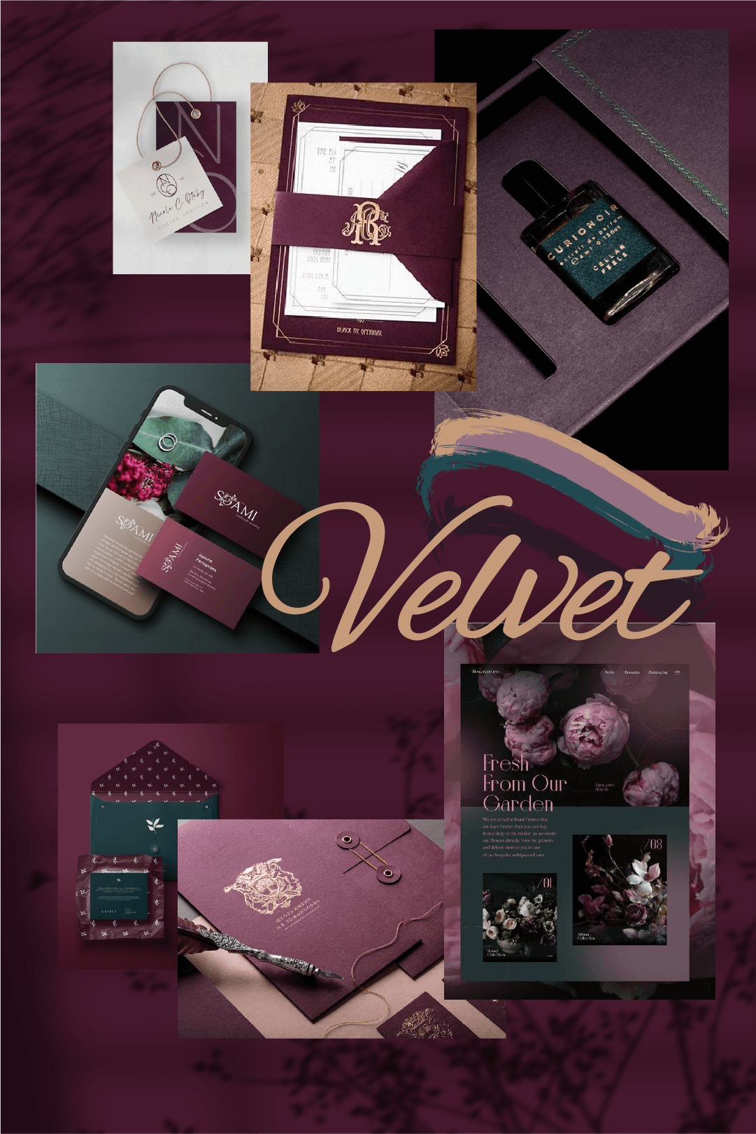
Best Use for Brands
Luxury Goods
For high-end products, these tones create a premium aesthetic that captivates and assures quality. Subtle contrasts and sophisticated harmonies can elevate product packaging, store designs, and promotional materials, emphasizing exclusivity and timelessness.
Hospitality
Hotels, resorts, and fine dining establishments can use this palette to evoke comfort, warmth, and an inviting sense of sophistication. Soft tones for interior design or rich accents in promotional content help convey a message of luxury and trustworthiness.
Financial Services
These tones communicate reliability and stability, making them ideal for banks, investment firms, and consultancies. A well-balanced use of darker tones suggests professionalism, while softer contrasts create a welcoming, approachable brand image.
A Glimpse into History: The Purple Reign of Power
Did you know that purple has been associated with wealth, power, and exclusivity for centuries? In ancient times, the dye used to create purple fabrics was extracted from the mucous glands of sea snails, a labor-intensive process that made it incredibly rare and expensive. This exclusivity led to its adoption by royalty and religious leaders, with Roman emperors and Byzantine elites donning purple as a mark of their high status.
Want to Bring This Palette to Life?
If you’re interested in incorporating the colors of September’s “Your Color Palette” into your brand identity, Wolf&Fox Studio is here to help. We offer a variety of branding services, including logo design, brand strategy, and web design. Contact us today to discuss how we can help you create a brand that is both stylish and effective.

