June 2024
Your Color Palette
Your Color Palette:
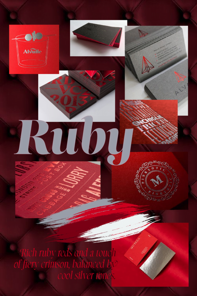
Ruby Radiance
This month’s “Your Color Palette” collection draws inspiration from the captivating ruby gemstone, offering a color story that embodies luxury, elegance, and timeless style. We’ve carefully curated a selection of reds and cool neutrals that work in harmony based on color psychology, creating a versatile palette for various brands.
Colors with Meaning and Influence:
- Blood Brother (#7a0014):
The heart of the palette, Blood Brother is a deep, luxurious red reminiscent of a precious ruby gemstone. It symbolizes passion, power, and sophistication, setting the tone for an undeniably luxurious brand identity. - Marilyn Monroe (#cc001e):
A vibrant, fire-engine red, Marilyn Monroe injects a burst of energy and excitement. It perfectly complements Blood Brother, adding a youthful and playful touch without sacrificing the overall elegance. - Dark Maroon (#390007):
This rich, dark red shade offers a sense of timeless sophistication and depth. Dark Maroon grounds the palette, adding a touch of seriousness and gravitas alongside the brighter reds. - Shining Knight (#9ba0ab):
A cool grey with a hint of silver, Shining Knight acts as the perfect counterpoint to the reds. It evokes feelings of innovation, modernity, and luxury, often seen paired with gemstones in jewellery settings. - Maui Mist (#f0f4f5):
This light grey with a subtle blueish undertone provides a clean and airy base. Maui Mist allows the bolder colors to take centre stage while offering essential grounding and a touch of spaciousness. - Dark Void (#0e0e0f):
A near-black shade, Dark Void adds a touch of drama and mystery. It creates a sense of depth and structure, ensuring a balanced and visually striking composition.

Color Psychology in Play:
The Ruby Radiance palette evokes a sense of luxury and timeless elegance, drawing inspiration from the captivating ruby gemstone. The colors work together to create a brand identity that is both bold and sophisticated.
- Rich, Deep Reds: The dominant red tones, exemplified by Blood Brother and Dark Maroon, symbolize passion, power, and sophistication. They immediately grab attention and command respect, perfect for brands seeking to make a lasting impression.
- Accents of Excitement and Innovation: Shining Knight, the cool grey with silver undertones, injects a touch of modernity and innovation, reflecting a brand that’s both established and forward-thinking.
- Grounding Neutrals: Maui Mist, the light grey with a hint of blue, and Dark Void, the near-black shade, provide balance and depth. They ensure the bolder colors remain impactful while offering a sense of stability and grounding.
Balancing Act: Accessibility and Contrast
While this palette features bold reds, creating accessible combinations is paramount. Shining Knight, a cool grey-silver, acts as the perfect counterpoint, ensuring readability and adherence to WCAG AA accessibility standards. This silver shade also complements the reds, reflecting the classic pairing of ruby jewellery with gleaming silver settings.

Perfectly Suited For:
- Jewellery and Luxury Goods:
The ruby gemstone connection makes it a natural fit for showcasing high-end products. - Fashion and Beauty:
Fashion brands can leverage the power red has to showcase bold styles, while beauty companies can utilize it to highlight statement lipsticks or evoke a sense of luxury for skincare products. - Technology and Innovation:
For tech brands, the silver and white tones offer a sleek, modern aesthetic, while the reds can be used sparingly for important call-to-actions.
Cultural Connections: The Allure of Ruby
Red holds significant meaning across cultures. In China, it symbolizes good luck and prosperity, while in many Western countries, it’s associated with love and passion. The ruby itself has been prized for centuries, considered a stone of wealth and protection. By incorporating these rich reds into your brand identity, you can tap into these symbolic associations.
A Note from the Designer
”This month’s palette holds a special place in my heart. The inspiration comes from the stunning ruby gemstone, with its rich color and captivating brilliance. The inclusion of red also has a personal touch – it’s my husband’s favorite color, and interestingly enough, both his and my daughter’s birthdays fall in June! The combination of bright and dark reds reflects the playful energy of youth alongside the timeless elegance and sophistication I strive for in my designs.”
Stay Inspired!
Remember, “Your Color Palette” releases new curated collections each month. Follow us on Pinterest (@studiowolfandfox) and Instagram (@wolfandfox.studio) to stay updated on the latest color inspiration!
If you’re captivated by this month’s color palette and envision it representing your brand, don’t hesitate to reach out! We at Wolf&Fox Studio can help you integrate these colors seamlessly into your brand identity, creating a truly luxurious and unforgettable experience for your customers.


