Studio – Web Design

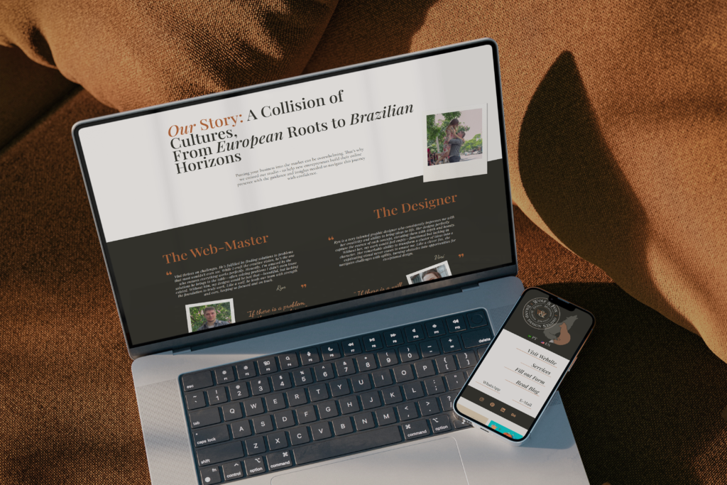
Wolf&Fox industry Digital Services Services Web Design view on Behance Project details — https://wolfandfoxstudio.com/wp-content/uploads/2024/10/Services2.mp4
That’s Gold – Visual Identity

That’s Gold industry Enterteinment Services Visual Identity Brand Strategy Social Media Design view on Behance Project details That’s Gold is a nostalgic, culture-based, talk tv show scheduled to broadcast on a local religious network. Hosted by a charismatic personality, the show takes viewers on a journey through the local history and culture of Belo Horizonte, Brazil. By exploring significant moments, notable personalities, and events, the host offers a fun, educational, and lighthearted perspective on the city’s past. Each episode is designed to be both engaging and spiritually uplifting. The logo for That’s Gold is designed to be both clever and meaningful. By removing the letter “L” from the word Gold, the title shifts to That’s God, symbolizing the show’s message that everything valuable in life has a divine origin. The ‘T’ in the logo is carefully crafted to resemble a cross, further emphasizing the divine meaning behind the show’s title. That’s Gold’s vibrant and full-of-life visual identity captures the retro spirit that defines the show. The bold color palette, bubbly, playful fonts, and dynamic design elements were created to evoke a nostalgic and lively feeling, bringing the viewer back in time and to represent the show’s cheerful approach to storytelling.
VA – Visual Identity

Herblore – Visual Identity

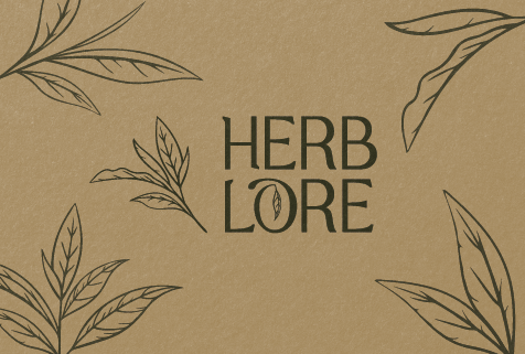
Herblore industry Health & Wellness Services Visual Identity Brand Strategy Packaging Design view on Behance Project details Herblore stands as a testament to the art of herbal remedies and natural wellness, blending rich tradition with a contemporary aesthetic to resonate with modern consumers. This passion project allowed us to showcase our expertise in developing a cohesive brand identity from scratch, tailored specifically for the natural wellness market. The result is a visual identity that exudes trust, purity, and premium quality, featuring an elegant logo with an abstract herb leaf, an earthy color palette, and a blend of modern serif typography. At the heart of Herblore’s philosophy is its commitment to sustainability, reflected in its use of eco-friendly practices throughout production and packaging. Emphasizing natural ingredients and holistic healing, the brand employs botanical illustrations and clean, modern typography to communicate authenticity and simplicity.
