Novembro – Your Color Palette 2024
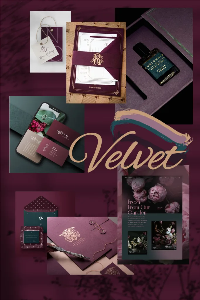
November 2024 Your Color Palette Designing a world of ageless sophistication. Velvet Reverie Step into a world where luxury and premium appeal meet subtle sophistication. The curated color palette of deep, rich tones exudes timeless elegance, ideal for brands aiming to position themselves as high-end and refined. Each hue is carefully selected to convey a sense of exclusivity, stability, and aspiration. Whether creating a sense of trust, evoking warmth, or suggesting opulence, this palette resonates deeply with consumers on a psychological level, ensuring your brand leaves an unforgettable impression. #48192E #957083 #281822 #D3CBC4 #C59C79 #204952 The Colors & Their Psychology Each color in this palette holds a distinct psychological significance, contributing to the overall message of sophistication and elegance. Let’s explore the essence of these hues: #48192E Blackberry A deep, regal purple that symbolizes power and luxury. Historically associated with royalty, this shade conveys ambition and prestige, making it perfect for brands seeking to project authority and exclusivity. #957083 Meadow Flower A gentle, muted purple offering a softer take on sophistication. This tone evokes calmness and creativity, providing balance to bolder hues in the palette while still maintaining an air of elegance. #204952 Moscow Midnight A dark-toned blue exuding trust and reliability. This color is commonly associated with depth and intelligence, grounding the palette and adding a mysterious, dependable undertone. #C59C79 Copper Moon A refined light brown with golden undertones that symbolizes wealth and achievement. This color’s warmth creates a sense of comfort and affluence, adding a luminous contrast to the darker hues. #D3CBC4 Pediment A light, neutral beige that brings softness and subtlety. Its understated elegance ties the palette together, ensuring harmony and approachability across applications. #281822 Kurobeni A nearly black purple that deepens the palette’s mystique. It adds dramatic intensity, making it ideal for bold accents or emphasizing luxury in branding. Mixing & Matching Whether contrasting or harmonizing, these colors collectively communicate an overarching sense of elegance, trust, and premium quality. By strategically leveraging these hues, brands can appeal to emotions and values that resonate deeply with their target audience. Mystic Depth Blackberry and Moscow Midnight Blackberry and Moscow Midnight This pairing balances the richness of Blackberry’s regal purple, symbolizing luxury, creativity, and ambition, with Moscow Midnight’s dark blue, evoking trust and stability. Together, these colors create a sophisticated yet mysterious vibe, ideal for brands seeking to project prestige with a grounded edge. This combination works well in industries like luxury tech or exclusive financial services, where authority and reliability are key. Soft Grandeur Meadow Flower and Copper Moon Meadow Flower’s muted purple adds a touch of serenity and creativity, while Copper Moon’s golden-brown tones bring warmth, wealth, and elegance. The blend creates an inviting yet refined aesthetic, perfect for boutique hospitality or artisanal brands. It communicates comfort, inspiration, and affluence, striking a balance between approachability and sophistication. Best Use for Brands Luxury Goods For high-end products, these tones create a premium aesthetic that captivates and assures quality. Subtle contrasts and sophisticated harmonies can elevate product packaging, store designs, and promotional materials, emphasizing exclusivity and timelessness. Hospitality Hotels, resorts, and fine dining establishments can use this palette to evoke comfort, warmth, and an inviting sense of sophistication. Soft tones for interior design or rich accents in promotional content help convey a message of luxury and trustworthiness. Financial Services These tones communicate reliability and stability, making them ideal for banks, investment firms, and consultancies. A well-balanced use of darker tones suggests professionalism, while softer contrasts create a welcoming, approachable brand image. A Glimpse into History: The Purple Reign of Power Did you know that purple has been associated with wealth, power, and exclusivity for centuries? In ancient times, the dye used to create purple fabrics was extracted from the mucous glands of sea snails, a labor-intensive process that made it incredibly rare and expensive. This exclusivity led to its adoption by royalty and religious leaders, with Roman emperors and Byzantine elites donning purple as a mark of their high status. Want to Bring This Palette to Life? contact us If you’re interested in incorporating the colors of September’s “Your Color Palette” into your brand identity, Wolf&Fox Studio is here to help. We offer a variety of branding services, including logo design, brand strategy, and web design. Contact us today to discuss how we can help you create a brand that is both stylish and effective. Stay Inspired! Remember, “Your Color Palette” releases new curated collections each month. Follow us on Pinterest and Instagram to stay updated on the latest color inspiration! Pinterest Instagram October – Your Color Palette 2024 7 October 2024 Your Color Palette / Blog September – Your Color Palette 2024 2 September 2024 Your Color Palette / Blog August – Your Color Palette 2024 6 August 2024 Your Color Palette / Blog July – Your Color Palette 2024 27 June 2024 Your Color Palette / Blog Load More studiowolfandfox Share Copy To Clipboard Share on Facebook Share on Twitter Share on Pinterest studiowolfandfox Share Copy To Clipboard Share on Facebook Share on Twitter Share on Pinterest studiowolfandfox Share Copy To Clipboard Share on Facebook Share on Twitter Share on Pinterest studiowolfandfox Share Copy To Clipboard Share on Facebook Share on Twitter Share on Pinterest studiowolfandfox Share Copy To Clipboard Share on Facebook Share on Twitter Share on Pinterest studiowolfandfox Share Copy To Clipboard Share on Facebook Share on Twitter Share on Pinterest studiowolfandfox Share Copy To Clipboard Share on Facebook Share on Twitter Share on Pinterest studiowolfandfox Share Copy To Clipboard Share on Facebook Share on Twitter Share on Pinterest studiowolfandfox Share Copy To Clipboard Share on Facebook Share on Twitter Share on Pinterest studiowolfandfox Share Copy To Clipboard Share on Facebook Share on Twitter Share on Pinterest studiowolfandfox Share Copy To Clipboard Share on Facebook Share on Twitter Share on Pinterest studiowolfandfox Share Copy To Clipboard Share on Facebook Share on Twitter Share on Pinterest
Studio – Web Design
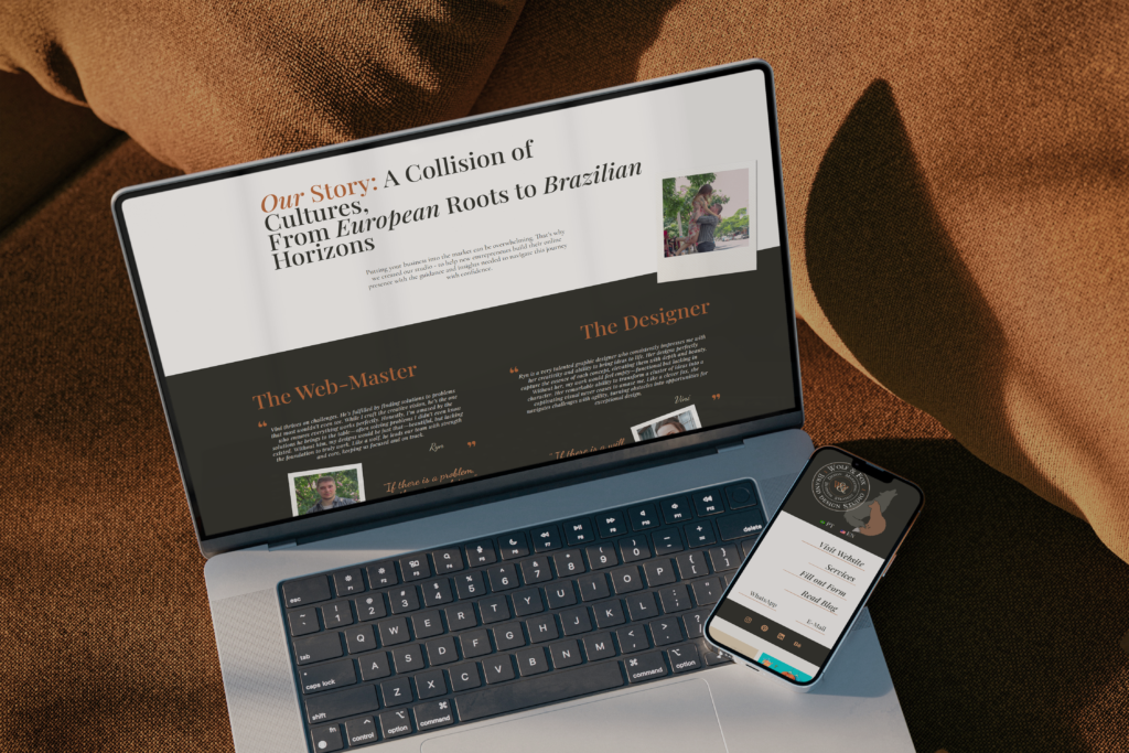
Wolf&Fox industry Digital Services Services Web Design view on Behance Project details — https://wolfandfoxstudio.com/wp-content/uploads/2024/10/Services2.mp4
Outubro – Your Color Palette 2024
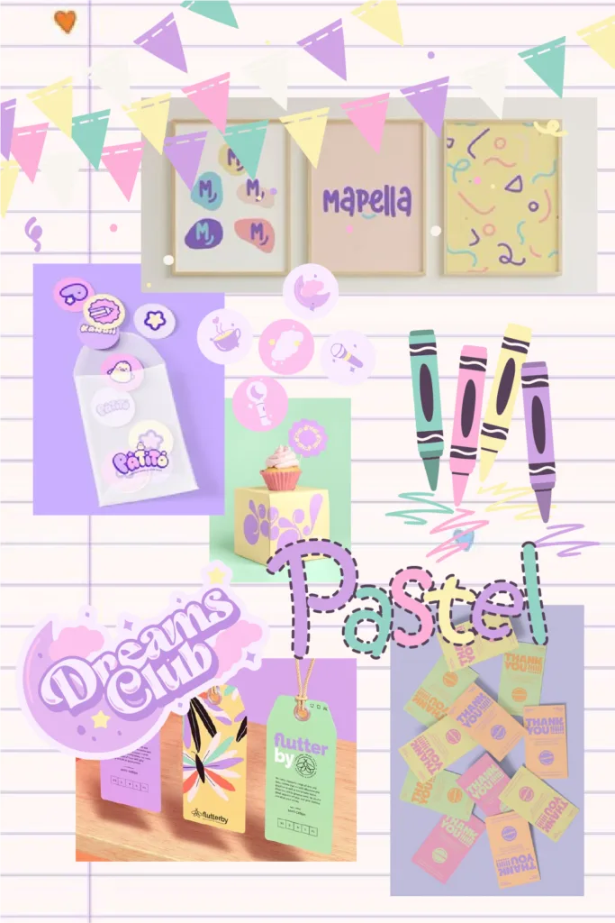
October 2024 Your Color Palette A Heartfelt Tribute to Children’s Day Pastel Dreams This October, we celebrate Children’s Day in Brazil, an occasion that inspires us to embrace the joy and creativity of childhood. We decided that it is good time for us to create a pastel color palette that reflects a youthful and carefree spirit. These gentle hues capture the essence of innocence and imagination, making them ideal for brands looking to resonate with families and convey a sense of playfulness. #FCB0D7 #94D4C6 #D1A5E6 #564159 #FBF1B5 #F8F5F0 The Colors & Their Psychology Every hue possesses its own distinct charm, shaping our feelings and perceptions of the world. Let’s explore how these six colors individually impact emotions and the connections they create. #FBF1B5 Tinker Light This pastel yellow radiates warmth and happiness. Known for promoting feelings of optimism and energy, it’s a soft hue that can brighten up any visual design without overwhelming the viewer. #FCB0D7 Lavender Candy A delicate pastel pink, associated with sweetness and kindness. It brings a gentle touch of innocence and tenderness, often evoking a sense of care and nurturing. #94D4C6 Pop Shop This mint blue carries a refreshing and calming quality. It combines the tranquillity of blue with the liveliness of green, creating a sense of balance and clarity. #D1A5E6 Bright Ube A pastel purple that hints at creativity and imagination. It brings forward a feeling of curiosity and wonder, often associated with dreamlike or whimsical concepts. #564159 Purple Bloom This dark pastel purple introduces depth and sophistication. While it maintains the playful nature of the other colors, it also brings a sense of calm and contemplation. #F8F5F0 Smart White A neutral white that ties the palette together. Its simplicity ensures that it doesn’t distract, allowing the other colors to shine while adding clarity and purity to the design. Mixing & Matching When used collectively, these colors form a cohesive visual narrative of creativity, playfulness, and balance. The combination of light pastels with darker tones achieves a youthful, energetic feel while maintaining a level of sophistication. This makes the palette versatile for brands targeting children and families, from toy manufacturers to educational institutions, offering an inviting yet polished look. Although they work harmoniously together, certain color combinations can be tailored for specific outcomes: Purple Bloom, Bright Ube, and Smart White Ideal for educational brands, this trio adds depth and focus while maintaining a clean, approachable look. Perfect for schools or learning-focused services. Tinker Light, Lavender Candy, and Pop Shop A soft, playful mix suited for baby or toddler products, with pastel yellow and pink adding warmth, and mint blue providing a fresh touch. Great for feminine or nursery-related designs. Best Use for Brands Whether used in advertisements, social media graphics, or packaging, this palette encourages engagement and evokes positive emotions, drawing customers in. The combination of soft pastels creates a welcoming atmosphere, making it ideal for brands aiming to connect with families and children. Children’s Products Whether for toys, clothing, or books, this palette’s light, bright, and gentle tones speak directly to a young, playful audience, providing a comforting and inviting visual identity. Education Schools and educational brands can use this palette to create engaging, approachable, and safe environments that encourage learning and creativity. Entertainment & Media For brands in the entertainment industry targeting younger audiences, these colors evoke excitement and fun without being overly bold, ensuring a welcoming experience. Celebrating the Joy of Childhood in Brazil Children’s Day, celebrated on October 12th, is a national and religious holiday in Brazil, honoring Our Lady of Aparecida, the country’s patroness. This year marks the 100th anniversary of this celebration, which originated in the early 20th century when educators and social workers sought to promote children’s well-being and highlight their importance in society. Families come together to celebrate with fun outings, lively parties, and thoughtful gift-giving. Parents delight in treating their children to toys, games, and delicious meals, filling the day with laughter and love. As we celebrate Children’s Day, we embrace the spirit of playfulness and the joy that children bring into our lives, inviting everyone to share in this beautiful celebration. Want to Bring This Palette to Life? contact us If you’re interested in incorporating the colors of September’s “Your Color Palette” into your brand identity, Wolf&Fox Studio is here to help. We offer a variety of branding services, including logo design, brand strategy, and web design. Contact us today to discuss how we can help you create a brand that is both stylish and effective. Stay Inspired! Remember, “Your Color Palette” releases new curated collections each month. Follow us on Pinterest and Instagram to stay updated on the latest color inspiration! Pinterest Instagram October – Your Color Palette 2024 7 October 2024 Your Color Palette / Blog September – Your Color Palette 2024 2 September 2024 Your Color Palette / Blog August – Your Color Palette 2024 6 August 2024 Your Color Palette / Blog July – Your Color Palette 2024 27 June 2024 Your Color Palette / Blog Load More studiowolfandfox Share Copy To Clipboard Share on Facebook Share on Twitter Share on Pinterest studiowolfandfox Share Copy To Clipboard Share on Facebook Share on Twitter Share on Pinterest studiowolfandfox Share Copy To Clipboard Share on Facebook Share on Twitter Share on Pinterest studiowolfandfox Share Copy To Clipboard Share on Facebook Share on Twitter Share on Pinterest studiowolfandfox Share Copy To Clipboard Share on Facebook Share on Twitter Share on Pinterest studiowolfandfox Share Copy To Clipboard Share on Facebook Share on Twitter Share on Pinterest studiowolfandfox Share Copy To Clipboard Share on Facebook Share on Twitter Share on Pinterest studiowolfandfox Share Copy To Clipboard Share on Facebook Share on Twitter Share on Pinterest studiowolfandfox Share Copy To Clipboard Share on Facebook Share on Twitter Share on Pinterest studiowolfandfox Share Copy To Clipboard Share on Facebook Share on Twitter Share on Pinterest studiowolfandfox Share Copy To Clipboard Share on Facebook Share on Twitter Share on Pinterest studiowolfandfox Share Copy To Clipboard Share on Facebook Share
Site - Porque você precisa de um
Blog / business share post Website – Why you need one The easy path to establishing your online identity In today’s digital age, a website is no longer a luxury; it’s a necessity. Whether you’re a seasoned entrepreneur, a budding startup, or a young professional just starting your career, having a well-designed website can significantly impact your business’s success. Dispelling the Myths: Websites Aren’t Difficult, Expensive, or Scary One of the biggest misconceptions about websites is that they’re complicated and costly to create. The truth is, while there are DIY website builders available, creating a professional and effective website requires a combination of design skills, technical expertise, and a deep understanding of your target audience. Moreover, the cost of creating a website is often comparable to other regular expenses, such as subscriptions to music platforms or news portals. Think about it: you’re investing in a tool that can generate revenue and build your brand. It’s a worthwhile investment that can pay off in the long run. Your Website: A Digital Business Card Imagine your website as a digital business card. It’s the first impression potential customers have of your business, and it can make or break their decision to engage with you. A well-designed website provides essential information about your business, such as your location, contact details, and a clear overview of your products or services. The Power of Online Visibility In the digital age, most people search for information online. If your business doesn’t have an established online presence, you’re essentially invisible to potential customers. A website helps you increase your online visibility and reach a wider audience. The Pain Points of Not Having a Website Imagine a customer trying to learn more about your business. They search for you online, but all they find are a few social media profiles with scattered information. This can lead to several pain points: Legitimacy concerns: Customers may question the legitimacy of your business if they can’t find a website. Inconvenience: Navigating through multiple social media platforms to find information can be time-consuming and frustrating for customers. Difficulty in verification: Customers may have trouble verifying your contact information or business details. Comparison with competitors: If your competitors have well-designed websites, your business may appear less professional and organized. “The internet is becoming the town square for the global village of tomorrow.” — Bill Gates The Benefits of Having a Website A website offers numerous benefits, including: Increased credibility: A website makes your business appear more professional and established. Improved customer experience: A well-designed website provides a positive user experience and makes it easier for customers to find information. Enhanced Search Engine Optimization: A website can help more people find your business online. When people search for what you offer, your website can appear higher in search results. 24/7 accessibility: Your website is available 24/7, allowing customers to access information whenever they need it. Opportunities for growth: A website can serve as a platform for marketing, sales, and customer support. Conclusion In today’s digital world, a website isn’t just a nice-to-have; it’s a must-have. It’s like having a storefront in the busiest part of town, except it’s open 24/7 and can reach customers worldwide. By debunking the myths about website creation and seeing the real benefits it can bring, you’re taking a proactive step toward growing your business. Your business deserves a digital home. Let’s build it together. At Wolf&Fox Studio, we’re committed to helping businesses like yours build a strong online presence. Our team of experienced designers and developers can create a custom website that reflects your brand and meets your specific needs. Let’s work together to take your business to the next level. Categories business your color palette Portfolio More in Blog Website – why you need one September – Your Color Palette 2024 That’s Gold – Visual Identity Load More share post Ready to have your own website ? Contact Us Previous PostNext Post
That’s Gold – Identidade Visual

That’s Gold industry Enterteinment Services Visual Identity Brand Strategy Social Media Design view on Behance Project details That’s Gold is a nostalgic, culture-based, talk tv show scheduled to broadcast on a local religious network. Hosted by a charismatic personality, the show takes viewers on a journey through the local history and culture of Belo Horizonte, Brazil. By exploring significant moments, notable personalities, and events, the host offers a fun, educational, and lighthearted perspective on the city’s past. Each episode is designed to be both engaging and spiritually uplifting. The logo for That’s Gold is designed to be both clever and meaningful. By removing the letter “L” from the word Gold, the title shifts to That’s God, symbolizing the show’s message that everything valuable in life has a divine origin. The ‘T’ in the logo is carefully crafted to resemble a cross, further emphasizing the divine meaning behind the show’s title. That’s Gold’s vibrant and full-of-life visual identity captures the retro spirit that defines the show. The bold color palette, bubbly, playful fonts, and dynamic design elements were created to evoke a nostalgic and lively feeling, bringing the viewer back in time and to represent the show’s cheerful approach to storytelling.
Agosto – Your Color Palette 2024
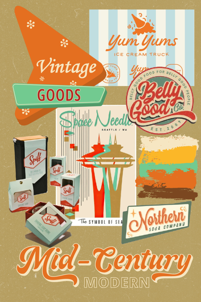
August 2024 Your Color Palette Reviving Retro Charm with a Modern Twist Mid-Century Modern Revival In this month’s edition of “Your Color Palette,” we’re taking a trip back in time to explore the world of mid-century modern design. This iconic style, popular from the 1950s to the 1970s, is known for its clean lines, pops of color, and focus on functionality. Our August palette captures the essence of mid-century modern with a twist, incorporating slightly brighter tints of the classic color scheme to create a look that feels both nostalgic and fresh. #E46F20 #F6E6C2 #FCB729 #B39A5A #7A4720 #73CA90 The Colors & Their Psychology Our August palette features six distinct colors, each chosen to evoke a specific emotion and contribute to the overall mid-century modern aesthetic. Together, these colors create a cohesive psychological impact, blending warmth and energy with stability and calm. #E46F20 Russet Orange This warm, energetic hue exudes a sense of optimism and enthusiasm, perfectly capturing the spirit of mid-century modern design. #FCB729 Sunflower Valley A mustard yellow that brings a sense of optimism and happiness. It’s a color that commands attention without overwhelming, making it a great choice for evoking positivity and a sense of reliability. #73CA90 Jocose Jade A light green that is calming and refreshing. It promotes a sense of balance and tranquillity, ideal for brands wanting to convey harmony and a connection to nature. #7A4720 Vintage Wood A rich brown that grounds the palette, offering a sense of stability and reliability. It adds a touch of sophistication and can help create a feeling of trustworthiness. #B39A5A Antique Gold This yellow-brown tone carries a sense of tradition and luxury. It adds depth to the palette and can be used to convey a sense of quality and timelessness. #F6E6C2 Melted Wax A soft, warm white that brings a sense of purity and openness. It balances the bolder tones in the palette, creating a sense of space and light. Mixing & Matching This palette’s versatility shines through in its ability to adapt to various brand identities. By experimenting with different combinations of these colors, you can achieve a wide range of visual effects, from playful and bright to luxurious and stable. Pop and Bright Look Pairing Russet Orange, Sunflower Valley, and Jocose Jade brings out a vibrant, fresh feel. This combination exudes creativity and optimism, ideal for brands looking to convey innovation and a youthful, energetic spirit. Luxury and Stable Look Combining Antique Gold, Vintage Wood, and Melted Wax creates a more sophisticated and grounded aesthetic. This trio evokes a sense of tradition, luxury, and reliability, making it suitable for brands that want to emphasize quality and timelessness. Industry Applications This mid-century modern-inspired palette is perfect for a variety of brands, particularly those that want to evoke feelings of nostalgia, optimism, and sophistication. It can be particularly well-suited for brands in industries such as: Furniture Brands crafting mid-century modern or retro-inspired furniture can use this palette to evoke the timeless appeal of the era, enhanced with a modern twist that speaks to contemporary tastes. Interior Design Companies specializing in retro-style interiors can utilize these colors to authentically capture the vintage aesthetic, offering clients a cohesive and stylish design rooted in mid-century modern influences. Tech Tech companies offering products with a retro theme can leverage this palette to create a sense of nostalgia, blending classic charm with modern innovation to captivate customers. The Legacy of Mid-Century Modern Design Mid-century modern design emerged in the mid-20th century, characterized by clean lines, organic forms, and a focus on functionality. It was a reaction to the post-war era’s need for simplicity and practicality, yet it also brought a sense of optimism and innovation to everyday spaces. The style became iconic for its ability to blend form and function, creating pieces that were both aesthetically pleasing and highly practical. Today, mid-century modern continues to influence contemporary design with its timeless appeal. Its emphasis on minimalism, natural materials, and seamless integration with the environment has left a lasting impact, making it a go-to reference for designers who seek to balance modernity with a touch of nostalgic elegance. Stay Inspired! Remember, “Your Color Palette” releases new curated collections each month. Follow us on Pinterest and Instagram to stay updated on the latest color inspiration! Pinterest Instagram Want to Bring This Palette to Life? contact us If you’re interested in incorporating the colors of September’s “Your Color Palette” into your brand identity, Wolf&Fox Studio is here to help. We offer a variety of branding services, including logo design, brand strategy, and web design. Contact us today to discuss how we can help you create a brand that is both stylish and effective. Leave a Comment Cancel reply Logged in as Wolf&Fox Studio. Edit your profile. Log out? Required fields are marked * Message* September – Your Color Palette 2024 2 September 2024 Your Color Palette August – Your Color Palette 2024 6 August 2024 Your Color Palette / Blog July – Your Color Palette 2024 27 June 2024 Your Color Palette / Blog June – Your Color Palette 2024 5 June 2024 Your Color Palette / Blog Load More Share Copy To Clipboard Share on Facebook Share on Twitter Share on Pinterest Share Copy To Clipboard Share on Facebook Share on Twitter Share on Pinterest Share Copy To Clipboard Share on Facebook Share on Twitter Share on Pinterest Share Copy To Clipboard Share on Facebook Share on Twitter Share on Pinterest Share Copy To Clipboard Share on Facebook Share on Twitter Share on Pinterest Share Copy To Clipboard Share on Facebook Share on Twitter Share on Pinterest Share Copy To Clipboard Share on Facebook Share on Twitter Share on Pinterest Share Copy To Clipboard Share on Facebook Share on Twitter Share on Pinterest Share Copy To Clipboard Share on Facebook Share on Twitter Share on Pinterest Share Copy To Clipboard Share on Facebook Share on Twitter Share on Pinterest Share Copy To Clipboard Share on Facebook Share on Twitter Share on Pinterest Share Copy To Clipboard
