Maio – Your Color Palette 2024
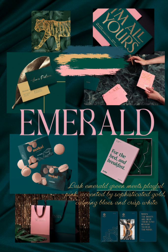
MAY 2024 Your Color Palette Your Color Palette: EMERALD Sophistication As May unfolds, bringing with it the vibrancy of spring, Wolf & Fox Studio is thrilled to unveil our latest curated color palette: Emerald Sophistication. Inspired by the rich emerald green of precious gemstones and the delicate charm of blossoming gardens, this palette offers a harmonious blend of elegance and natural beauty. #004D3F #215261 #E6B373 #FFB1B0 #FCF1EA #092629 Colors with Meaning and Influence: Enchanted Emerald (#004D3F): The jewel-toned heart of the palette, Enchanted Emerald is a captivating cyan-green with the luxurious allure of a precious gem. It symbolizes growth, renewal, and harmony with nature, perfectly capturing the essence of spring. Fancy Flamingo (#FFB1B0): A soft, light pink reminiscent of delicate rose blossoms, Fancy Flamingo adds a touch of femininity and playfulness. It creates a delightful contrast with the Enchanted Emerald, injecting a touch of whimsy without overpowering the overall sophistication. Pyramid Gold (#E6B373): This warm, light shade of brown evokes a sense of sophistication and stability. Like the gilded pyramids of antiquity, it adds a touch of timeless elegance and complements the other colors beautifully. Moonlit Pool (#215261): A medium-dark shade of cyan, Moonlit Pool serves as the palette’s grounding force. It evokes a sense of tranquillity and peace, reminiscent of a moonlit evening by a still pool. This blue-teal hue acts as an excellent choice for text and design elements, ensuring readability and visual balance. Albino (#FCF1EA): This near-white shade provides a clean and airy base, allowing the other colors to shine. It represents purity, simplicity, and a fresh start – perfect for brands seeking a modern and minimalist aesthetic. Fence Green (#092629): The darkest shade of the palette, Fence Green, provides a sense of depth and structure. This rich blue acts as a beautiful counterpoint to the lighter colors, adding a touch of seriousness and authority. Using the Palette: The beauty of this palette lies in its versatility. Here are some potential combinations that maintain WCAG AA accessibility standards: For a classic and sophisticated look: Combine Enchanted Emerald with Pyramid Gold and Albino for a timeless and elegant feel. For a touch of whimsy: Pair Fancy Flamingo with Moonlit Pool and Albino for a light-hearted and playful aesthetic. For a brand that wants to project authority: Use a combination of Enchanted Emerald, Fence Green, and Albino to create a sense of trust and professionalism. Color Psychology in Action: The Emerald Sophistication palette cleverly leverages the psychology of color to create a specific brand impression. Here’s a breakdown of the message each color conveys: Emerald green inspires feelings of growth, wealth, and harmony. Light pink (Fancy Flamingo) evokes emotions of love, compassion, and playfulness. Gold (Pyramid Gold) symbolizes luxury, success, and wisdom. Blue (Moonlit Pool and Fence Green) creates a sense of trust, security, and calmness. Moonlit Pool leans more towards a calming teal, while Fence Green provides a sense of depth and authority with a richer blue tone. White (Albino) represents purity, cleanliness, and a fresh start. By combining these colors, the palette creates an overall feeling of sophistication, growth, and tranquillity, perfectly suited for brands that want to evoke these emotions. Emerald Sophistication for Brands: This versatile palette is a perfect fit for a variety of brands, including: Fashion and Beauty: The combination of elegance and playfulness makes it ideal for showcasing both classic and trendy styles. Wellness and Spa: The calming blues and greens evoke a sense of tranquillity, perfect for promoting relaxation and rejuvenation. Luxury Goods and Services: The gold and emerald combination exudes an air of sophistication and high quality. Environmental and Sustainability Focused Brands: The natural greens and blues connect with themes of growth, renewal, and harmony with nature. Stay Inspired! Looking for more color inspiration? Be sure to follow us on Pinterest (@studiowolfandfox) and Instagram (@wolfandfox.studio) to discover our latest curated palettes and design trends. If the “Emerald Sophistication” palette resonates with your brand vision, Wolf & Fox Studio would be delighted to collaborate with you. We can help you integrate these colors seamlessly into your brand identity, creating a visually appealing and impactful presence. Leave a Comment Cancel reply Logged in as Wolf&Fox Studio. Edit your profile. Log out? Required fields are marked * Message* July – Your Color Palette 2024 27 June 2024 June – Your Color Palette 2024 5 June 2024 May – Your Color Palette 2024 6 May 2024 April – Your Color Palette 2024 26 March 2024 Load More
Abril – Your Color Palette 2024
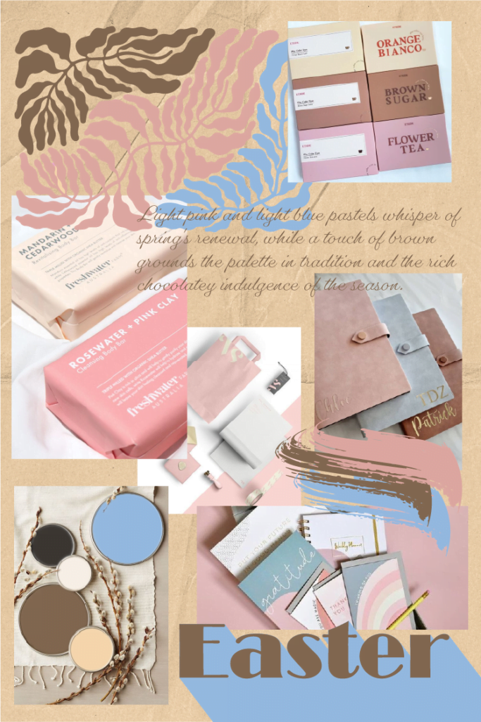
April 2024 Your Color Palette Your Color Palette: Easter joy As the spirit of renewal and fresh beginnings takes centre stage for Easter celebrations around the world, here at Wolf&Fox Studio, we’ve curated a special “Your Color Palette” that captures this essence perfectly. Inspired by the symbolism of the holiday, this collection offers a versatile range of colors to elevate your brand identity. #DEA8A2 #95BAE1 #F7D7AD #F9F1E8 #3D3833 #826851 Colors with Meaning and Influence: Coral Cove (#DEA8A2): This light pink hue embodies a gentle awakening, reflecting the love and compassion associated with Easter. Fleck (#95BAE1): Like the clear blue sky after a storm, this light blue evokes feelings of calmness and peace, aligning with the spiritual renewal and hope associated with Easter. Ice Cream Parlour (#F7D7AD): This creamy light beige acts as a grounding element, mimicking the natural warmth of the sun. Beige promotes feelings of stability and comfort. Powdered (#F9F1E8): This almost-white shade provides a clean and airy feel, similar to the blank canvas of a freshly dyed Easter egg. Pastel Brown (#826851): This chocolate brown brings a touch of earthiness, reminiscent of the natural world and the tradition of chocolate Easter eggs. Brown represents reliability and security. Kilimanjaro (#3D3833): A deep, rich brown adds depth and sophistication. Versatility Unbound: The beauty of this palette lies in its ability to transform depending on your needs. Use the full spectrum of colors for a vibrant and playful look that pops, or focus on the lighter shades for a calming and serene feel. This palette can also be easily split into complementary sub-palettes. Pair Coral Cove with Fleck for a youthful energy, or combine Ice Cream Parlour with the browns for a more organic and grounded feel. No matter your vision, this collection offers the building blocks to bring it to life. A Palette for All: This collection transcends industries and can be a perfect fit for a variety of brands: Food & Beverage: Bakeries, cafes, and restaurants can leverage the palette to evoke feelings of warmth, comfort, and delicious treats. Fashion & Lifestyle: Coral Cove and Fleck can bring a touch of cheer to clothing lines, while Ice Cream Parlour and the browns create a sophisticated base for homeware collections. Wellness & Relaxation: The calming blues and grounding browns are ideal for spas, yoga studios, and brands promoting self-care. Beyond the Surface: Color and Brand Messaging Easter isn’t just about colors; it’s about renewal and fresh starts. This palette can be used not just for visual branding, but also to inspire brand messaging. The light pinks and blues can represent a new product launch, while the browns can symbolize the brand’s commitment to sustainability and eco-friendly practices. By weaving these symbolic elements into your brand story, you can create a deeper connection with your audience and embrace the spirit of renewal. Discover Your Perfect Palette: “Your Color Palette” releases new curated collections each month, offering a fresh take on color combinations. Follow us on Pinterest (@studiowolfandfox) and Instagram (@wolfandfox.studio) to stay updated on the latest releases. If you enjoy the Easter-inspired vibes of this palette and see it reflecting your brand identity, we’d love to hear from you! Wolf&Fox Studio can help you integrate these colors seamlessly into your brand design, ensuring a message that resonates with your audience. Leave a Comment Cancel reply Logged in as Wolf&Fox Studio. Edit your profile. Log out? Required fields are marked * Message* July – Your Color Palette 2024 27 June 2024 June – Your Color Palette 2024 5 June 2024 May – Your Color Palette 2024 6 May 2024 April – Your Color Palette 2024 26 March 2024 Load More
Março – Your Color Palette 2024
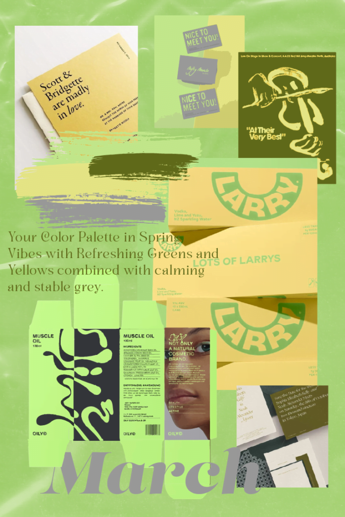
MARCH 2024 Your Color Palette Your Color Palette: Spring Awakening This month, “Your Color Palette” welcomes spring with a collection of soft, modern hues inspired by the season’s gentle awakening. The palette features a range of light and airy colors, perfectly capturing the essence of new beginnings. #C4E98D #9B9B9B #F2FAE6 #616B1B #E7E787 #2A2A27 Color Descriptions Refreshed: This light shade of green evokes the feeling of new growth, symbolizing hope and renewal. Amnesiac White: This almost-white color with a subtle mint undertone adds a touch of coolness and serenity. Tender Sprout: A gentle light shade of yellow, reminiscent of spring sunshine, infuses the palette with warmth and optimism. Fern Frond: This green shade, reminiscent of lush foliage, represents nature and grounding stability. Hydrargyrum: A calming grey, like a smooth stone, provides a sense of balance and sophistication. Eternity: A very dark grey, reminiscent of a sturdy foundation, adds depth and sophistication. Color Psychology The “Spring Awakening” palette utilizes the positive associations of spring colors. Light greens and yellows promote feelings of growth, optimism, and new beginnings, while the greys offer stability and balance. This combination creates a sense of calm and hope, perfect for brands seeking to convey a fresh and positive image. Versatility and Accessibility Despite their pastel nature, these carefully chosen colors offer surprising versatility. They can be combined in various ways while still maintaining accessibility compliance with WCAG AA standards. Brand Applications This palette’s calming and modern aesthetic is ideal for a variety of brands, including: Wellness and lifestyle brands: The focus on nature and growth resonates with brands promoting health and well-being. Technology and innovation companies: The light and airy feel reflects a forward-thinking and progressive approach. Creative and design agencies: The modern and sophisticated look complements a creative and professional brand image. Looking for Your Perfect Palette? “Your Color Palette” releases a new selection of curated colors each month, offering endless inspiration for your brand identity. Follow us on Pinterest (@studiowolfandfox) and Instagram (@wolfandfox.studio) to stay updated on the latest releases. If you find yourself drawn to the “Spring Awakening” palette and envision it representing your brand, we invite you to contact us. We would be happy to explore how these colors can be integrated into your brand identity, creating a lasting impression. Leave a Comment Cancel reply Logged in as Wolf&Fox Studio. Edit your profile. Log out? Required fields are marked * Message* July – Your Color Palette 2024 27 June 2024 June – Your Color Palette 2024 5 June 2024 May – Your Color Palette 2024 6 May 2024 April – Your Color Palette 2024 26 March 2024 Load More
VA – Identidade Visual

Herblore – Identidade Visual
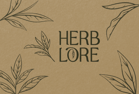
Herblore industry Health & Wellness Services Visual Identity Brand Strategy Packaging Design view on Behance Project details Herblore stands as a testament to the art of herbal remedies and natural wellness, blending rich tradition with a contemporary aesthetic to resonate with modern consumers. This passion project allowed us to showcase our expertise in developing a cohesive brand identity from scratch, tailored specifically for the natural wellness market. The result is a visual identity that exudes trust, purity, and premium quality, featuring an elegant logo with an abstract herb leaf, an earthy color palette, and a blend of modern serif typography. At the heart of Herblore’s philosophy is its commitment to sustainability, reflected in its use of eco-friendly practices throughout production and packaging. Emphasizing natural ingredients and holistic healing, the brand employs botanical illustrations and clean, modern typography to communicate authenticity and simplicity.
Fevereiro – Your Color Palette 2024
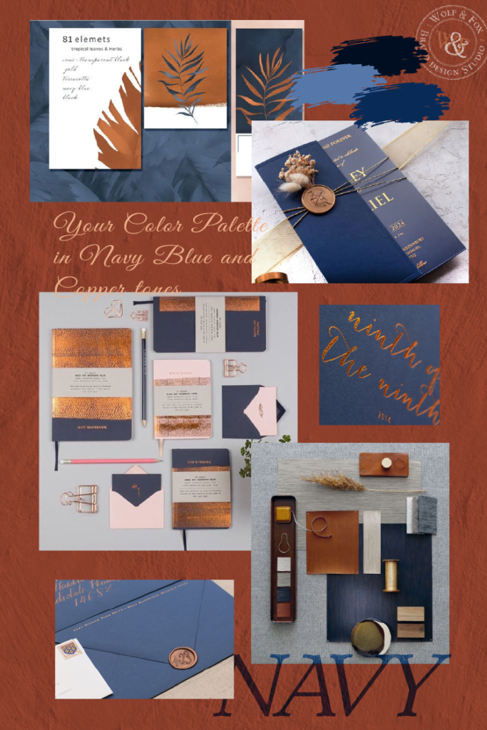
February 2024 Your Color Palette Your Color Palette: February’s Elegant Harmony Introducing “Elegance & Earth,” a curated February palette that blends timeless sophistication with rustic warmth. Inspired by the deep allure of navy blue and the rich patina of copper, this six-color harmony offers a versatile and inviting aesthetic for your brand. #031024 #883D2B #0A2B59 #EEB189 #587AAC #F7ECE9 Color Psychology Navy Blue: This steadfast hue evokes feelings of trust, stability, and reliability, perfect for conveying a sense of authority and professionalism. Copper: This warm tone symbolizes resilience, resourcefulness, and grounding, adding a touch of authenticity and earthiness to the palette. Light Blue & Beige: These calming colors soften the composition, creating a sense of tranquility and balance. Pinkish Beige: This subtle accent adds a touch of friendliness and approachability, making the palette feel more welcoming and approachable. Versatile Combinations This palette shines in various combinations while still meeting WCAG AA accessibility standards: Classic: Pair Downriver navy with Flax Flower blue for a professional and trustworthy look. Warm & Welcoming: Combine Rustica copper with Rusty Sand beige for a rustic and inviting feel. Sophisticated & Friendly: Use Black Knight dark blue and Ryn Flesh pinkish beige for a refined yet approachable aesthetic. Brand Applications This versatile palette is perfect for a variety of brands: Professional Services: Law firms, financial institutions, and consulting agencies can leverage the palette’s trustworthiness and authority. Creative Businesses: Craft shops, design studios, and handmade product makers can utilize the palette’s rustic warmth and authenticity. Lifestyle Brands: Wellness centers, spas, and yoga studios can benefit from the palette’s calming and tranquil atmosphere. New Colors Every Month “Your Color Palette” releases a curated palette each month, offering fresh inspiration for your brand. Follow us on Pinterest (@studiowolfandfox) and Instagram (@wolfandfox.studio) to stay updated with our latest color trends and design tips. Love this Palette? Let’s Collaborate! If Navy and Copper resonates with your brand vision, contact us at Wolf&Fox Studio. We’d love to help you integrate this palette seamlessly into your brand identity and create a truly captivating visual experience. Your Color Palette Journey Begins “Your Color Palette” is a continuous journey of exploration. Each month, we’ll unveil a new collection inspired by different themes and moods. Follow us on Pinterest and Instagram (@wolffoxstudio) to stay updated and discover the colors that resonate with your brand story. July – Your Color Palette 2024 27 June 2024 June – Your Color Palette 2024 5 June 2024 May – Your Color Palette 2024 6 May 2024 April – Your Color Palette 2024 26 March 2024 Load More
Peach Fuzz
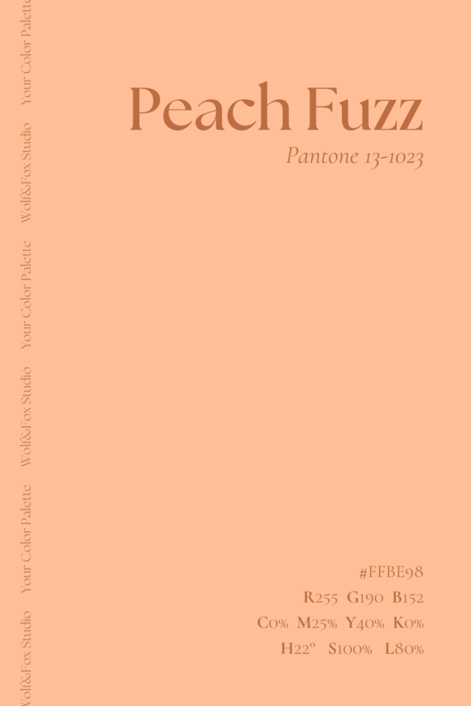
Color of the year 2024 Your Color Palette Peach Fuzz Stepping into the spotlight is the Color of the Year 2024—a captivating hue reminiscent of a soft embrace, aptly named Peach Fuzz. This warm tone effortlessly intertwines with our “January 2024” Color Palette, infusing a touch of inviting warmth into the cool and sophisticated greys. A testament to the power of thoughtful color curation, Peach Fuzz exemplifies the fusion of vibrancy with professionalism, creating a visually dynamic and harmonious aesthetic. Delving into the essence of Peach Fuzz, beyond its visual allure, reveals a fascinating narrative. According to Pantone color specialist Leatrice Eisman, this chosen color goes beyond aesthetics, leaving its mark across various industries—especially in fashion, design, and social media. With its light, fruity tone, Peach Fuzz captures the spirit of the times, reflecting a shift towards more calming design trends that mirror our culture’s emphasis on touch and connection. #ffbe98 July – Your Color Palette 2024 27 June 2024 June – Your Color Palette 2024 5 June 2024 May – Your Color Palette 2024 6 May 2024 April – Your Color Palette 2024 26 March 2024 Load More
Janeiro – Your Color Palette 2024
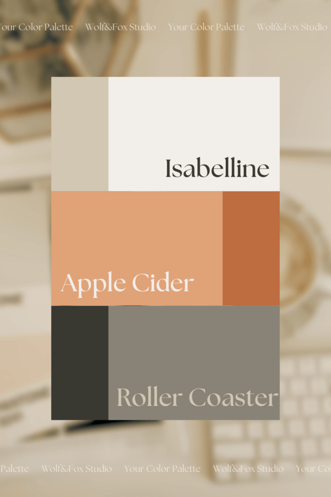
January 2024 Your Color Palette Wolf&Fox Studio Unveils January’s “Your Color Palette”: A Reflection of Innovation and Sophistication Wolf&Fox Studio is proud to introduce the first edition of “Your Color Palette,” a monthly series showcasing curated color collections that embody our design philosophy. January’s palette reflects our core values and sets the tone for an exciting new year. #D1C7B2 #BD6D40 #393831 #F3EEEC #E0A276 #898377 Color Psychology in Action We understand that color is more than just aesthetics; it’s a powerful tool that shapes perception and evokes emotions. The January palette leverages this understanding to tell a story about our brand. The Wolf Meets the Fox The vibrant Spiced Nut orange, reminiscent of the fox’s cunning and adaptability, stands out with an air of creative confidence. It’s balanced by the timeless Roller Coaster grey, representing the wolf’s steadfastness and strategic approach. This combination embodies the harmonious blend of innovation and sophistication that defines Wolf&Fox Studio. A Palette for Every Purpose Apple Cider offers a toned-down version of Spiced Nut, providing a touch of warmth and approachability. Velvet Beige complements Roller Coaster, adding softness and refinement. The light and airy Isabelline serves as a versatile base for backgrounds and contrast, while the deep Rosin adds depth and impact to text and accents. Embrace the Color of the Year Pantone’s “Peach Fuzz,” the 2024 Color of the Year, seamlessly integrates into our palette. Its optimistic energy aligns with our studio’s focus on growth and collaboration, symbolizing new possibilities while remaining grounded in our core values. Endless Creative Potential The beauty of this palette lies in its versatility. Each color holds its own meaning, but they truly shine when combined. Whether you choose a bold contrast of Spiced Nut and Rosin or a softer blend of Isabelline and Apple Cider, the possibilities are endless. And with WCAG AA requirement accessibility in mind, you can be confident your creations are inclusive for all audiences. Your Color Palette Journey Begins “Your Color Palette” is a continuous journey of exploration. Each month, we’ll unveil a new collection inspired by different themes and moods. Follow us on Pinterest and Instagram (@wolffoxstudio) to stay updated and discover the colors that resonate with your brand story. We invite you to explore the power of color psychology and create visual narratives that leave a lasting impression. Let January’s palette be your starting point – the possibilities are waiting to be unleashed. July – Your Color Palette 2024 27 June 2024 June – Your Color Palette 2024 5 June 2024 May – Your Color Palette 2024 6 May 2024 April – Your Color Palette 2024 26 March 2024 Load More
